In Post 2 I have included screenshots of the WAVE tracker accessibility report on the WordPress site. This identifies how accessible this webpage is to users. I have also added an infographic that was intended to be on Boyle’s Law, to help explore the design principals learned throughout the module.
Screenshot of WAVE accessibility report for Introduction Post from WordPress Blog.
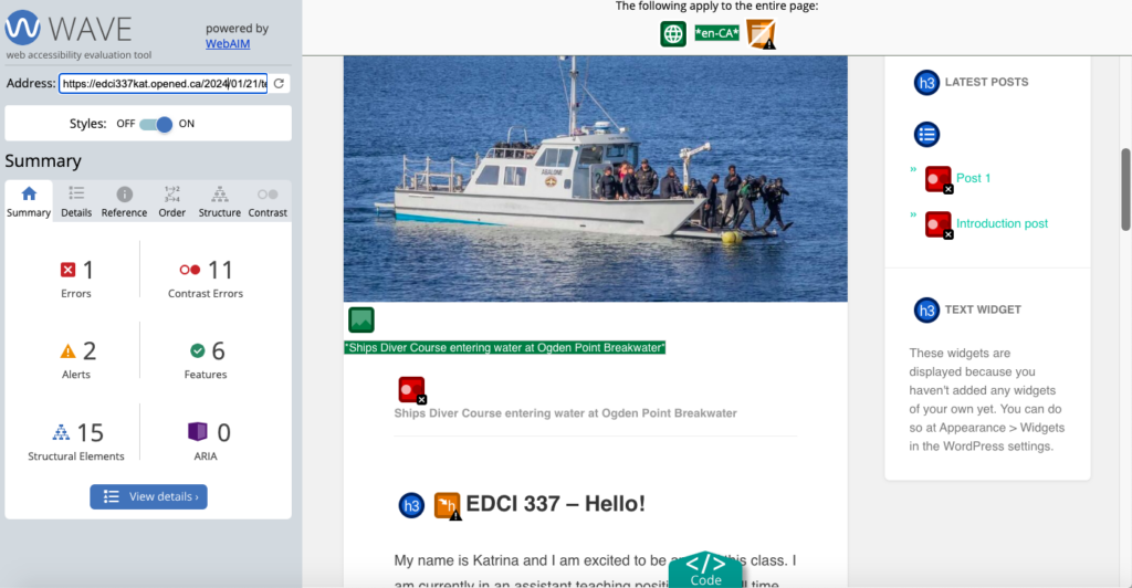
After using the WAVE accessibility report on all my posts and the home webpage of the WordPress site, I started to correct some of the errors immediately. The main correction being that I had made a hyperlink for the learning pod self reflection questions that brought it up as a Word document. This was flagged in the report and I decided to paste the entire text instead. As much as this made the post longer, it was easier for learners to read and not open up an additional document. I thought I was initially making the right choice with this hyperlink, but the WAVE made me reconsider, and it makes sense to me. The other detail being not everyone has Word available on their laptops, thus making it more accessible with this change.
Before module 2 I had not put a lot of thought into contrast and that some people may see differently than me. The main consistent error I noticed showing up on the report was the very low contrast between text and background colors. I did not change this on my WordPress site yet, but I will consider it as we continue our posts in the course.

Infographic about Boyle’s Law in relation to air diving.
While creating my infographic in Canva, I used the design principals of hierarchy, contrast, repetition, balance, colour and negative space to support my design. The infographic was intended to focus on learning about Boyle’s law. I tried to make it at the top of the page, with a rule that remembers why Boyle’s law is important for scuba diving. I also tried to come back to the law at the end of the infographic to help engage the learner. As I recognize if you knew nothing about scuba diving, your extrinsic load may be potentially overworked in this infographic as well. I tried to use repetition to resolve this. I used contrast, colour and negative space to all aid in the flow of learning intended for this infographic. The negative space was very useful I thought, and in the past I have used too many items in the negative space. The template aids in getting ideas going, it also provides a way to brainstorm other ideas easily. It helped with being able to create what you intend to portrait in the infographic. I really enjoyed using Canva and hope to continue to use it in the future.
Other reflection questions:
Text to speech tools
I used three of the different text to speech tools while learning throughout the module. I had a preference for certain voices, as they made it easier for me to comprehend what was being read aloud. I also found it easier to understand when I read with the text to speech. I wondered if the longer I use one of these tools, the easier it become to comprehend them and use them to aid in learning. I have been eager to try to get more into text to speech apps to aid in my learning and this was a great way to find one that I preferred.
What does inclusive design mean to you?
Inclusive design means to design the learning environment to be available for everyone. You should not have to re-design a course because of a student who is different, this should already be accounted for the first time making a video, infographic, webpage etc. By doing this, you allow easier learning for everyone.
An example of this could be captions in videos. Captions help those who are learning the language being captioned, for those with hearing impairments, and for those who may not be able to use the sound at that time.
Inclusive design benefits everyone, and graphic design is inherently visual. The additions and modifications needs to ensure learners with visual impairment are to include alternative text description in the form of a transcript. This is necessary for an inforgraphic as a full text version of the transcript is needed in order to be accessible for all readers.
Thank you for reading my blog post, and I hope we can strive to allow learning to be accessible for all.
2024-02-12 at 10:18 pm
Hello, I think the Canvs poster you made makes me very impressed. The selection, layout, font, and color are perfect. I can easily obtain information and read text. In addition, I also agree with your thoughts on text-turning voices, and I also prefer to listen to certain specific sounds. The unique tone of these sounds can strengthen my attention and immerse me in it.